I am...
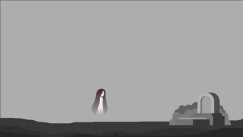
I am... tells the story of a girl who lost her memory and went on a journey to seek the truth about her existence. She has to collect enough keys to open the locks in her perception and reconnect with reality. What is the cause behind her fear of fire? Who were the hooded figures?
This was a 2-week long solo project. I designed the levels, most of the art and assets and wrote many scripts for the game.
Dev images and some visual design choices (For more info please read the Devlog & Postmortem!)
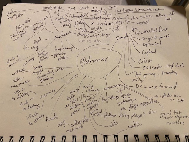
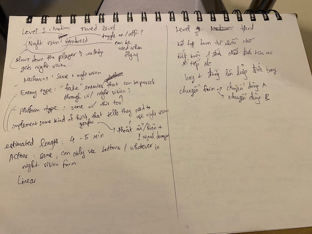
Initial brainstorm on Platformer genre:
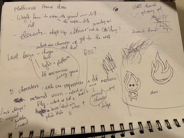
Mechanics ideas
Level Design elements and ideas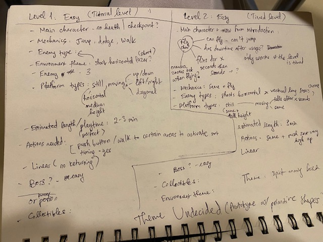
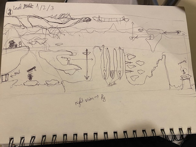
Map Sketches
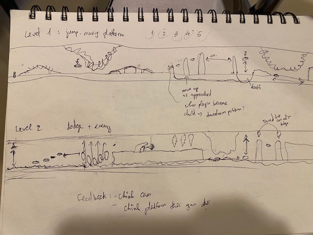
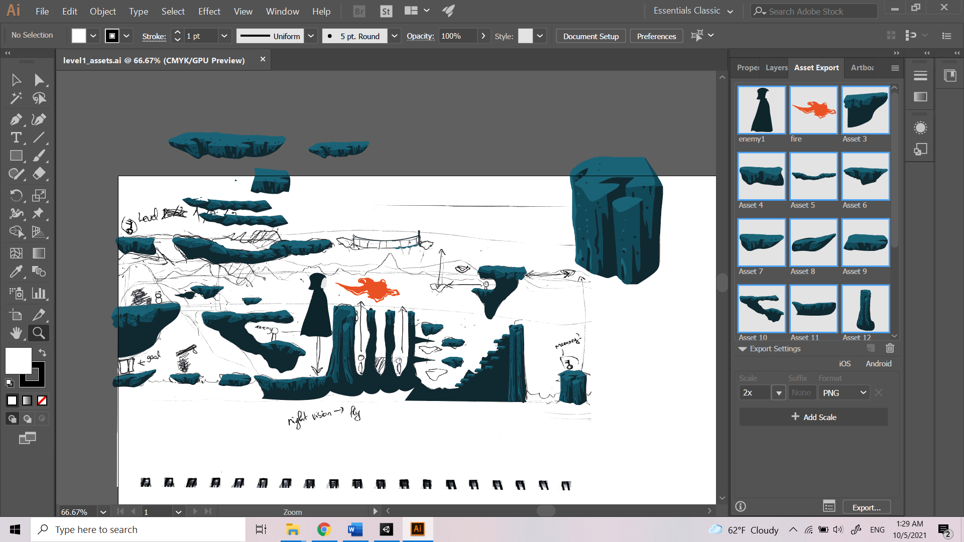
Testing to see if map works - making assets
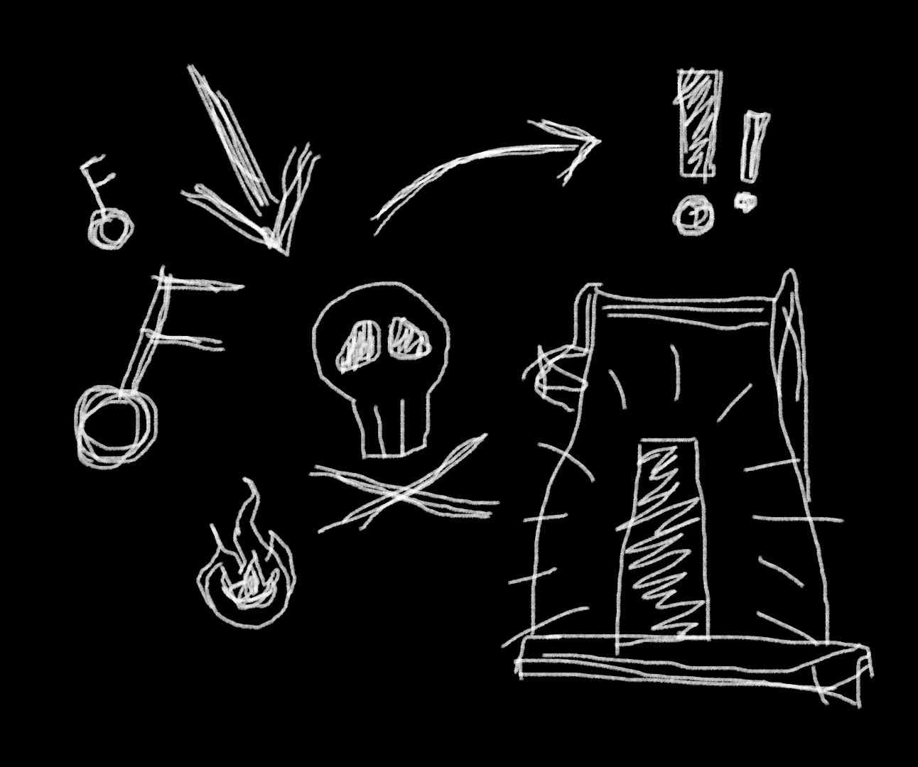
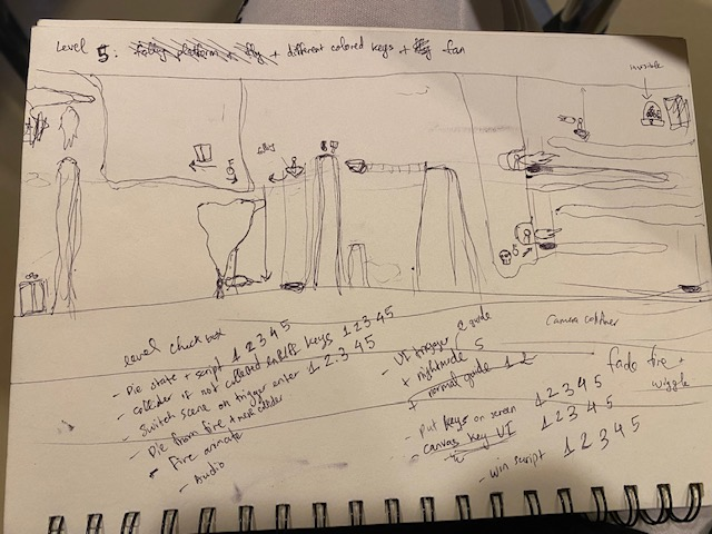
Markings for 5th level
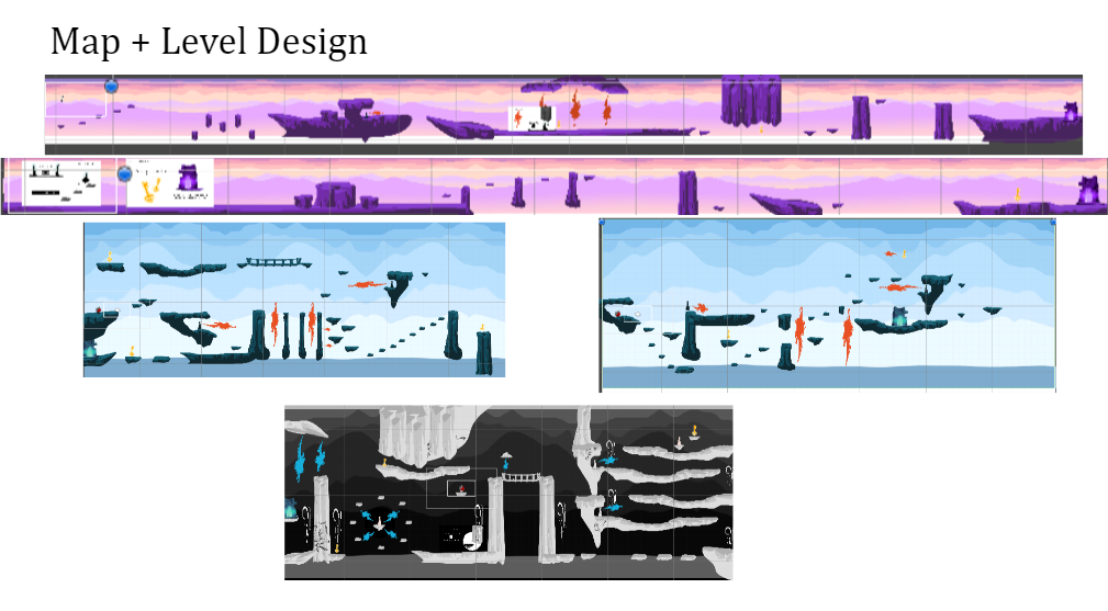
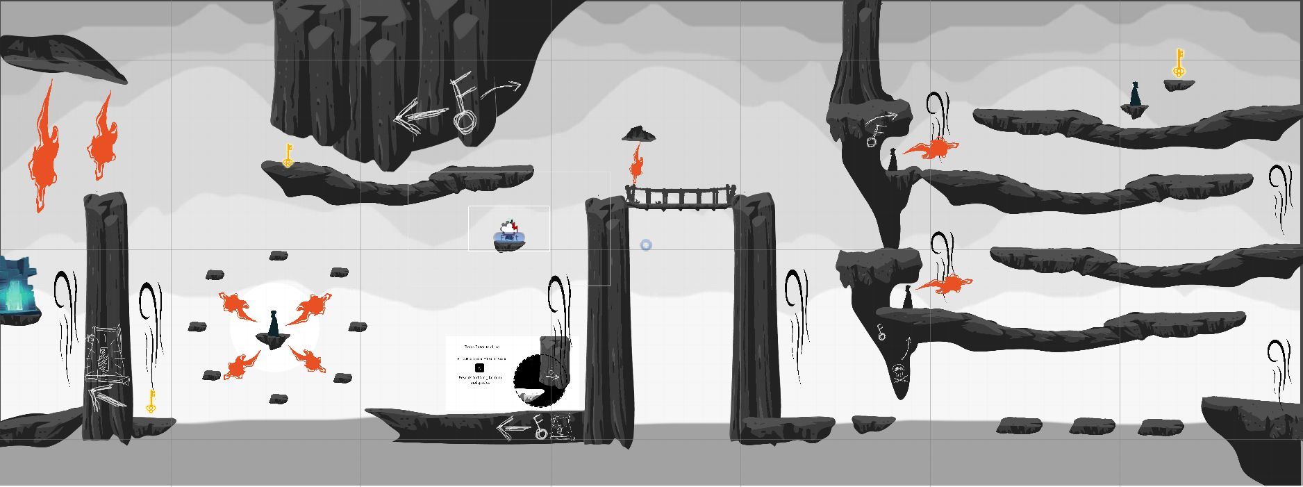
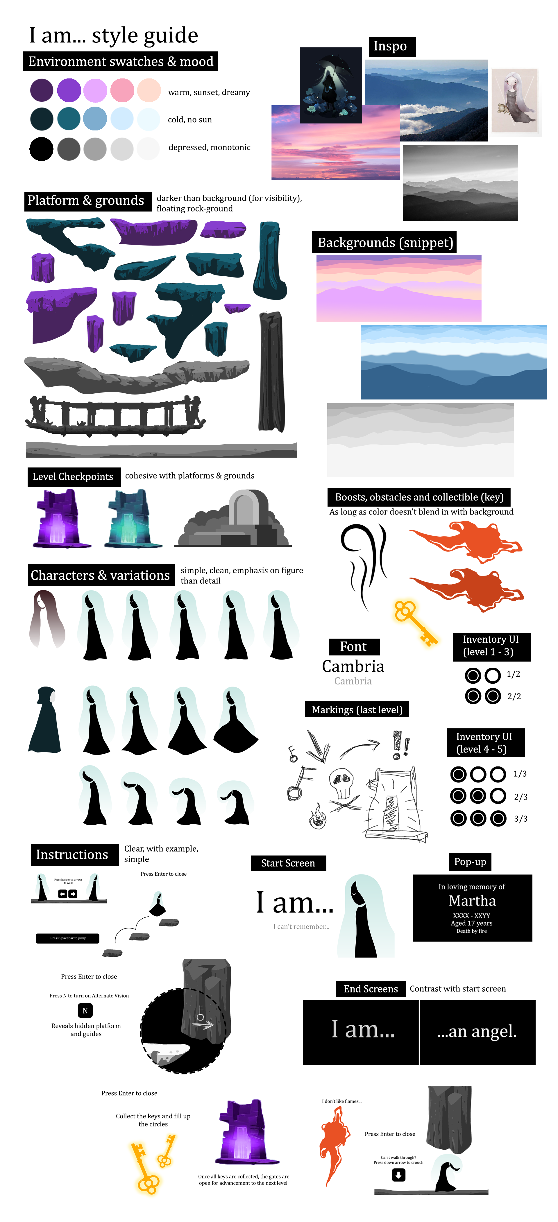
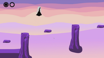
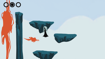
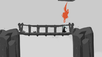
Each color represents a different difficulty. The pink levels are easy, the blue ones are medium and black/white one is hard. Aside from representing the difficulty levels, the colors also convey different moods in the game. As the main character progresses, she gets closer to discovering the harsh truth about her identity.
Task outline (by priority) to reduce the scope of the project in the time given

Playtesting Feedback
- The first feedback I got was that I should implement a way to guide players that they have to collect enough keys to pass through the gates e.g. an UI showing number of keys collected/total number. I got this feedback during the demo in class.
- The second feedback I got was that I should animate the fire. I planned to draw this, however I didn’t have this in the final product because I ran out of time and I had to prioritize the game working over visual effects.
- The third feedback is for me to balance the game at some parts e.g. the rate at which the fire blinks because it was very hard to get through the level when the player keeps dying.
- The final feedback I got was from my friend who noticed that sometimes it’s hard to know where they’re going due to the limit of the camera viewport.
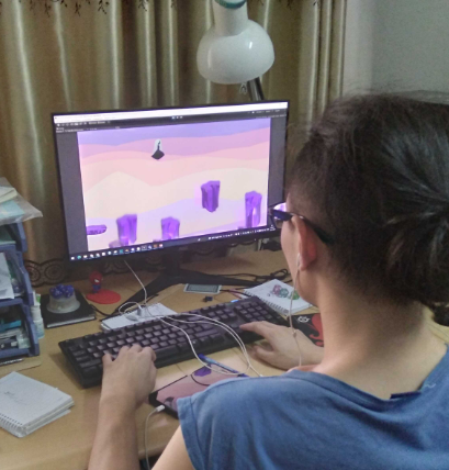
My playtester
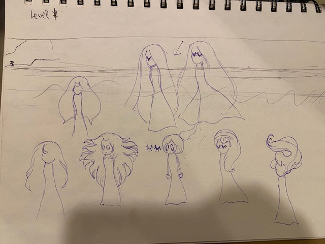
Character sketches

I chose this form because it is comprised of very simple and clear shapes. I didn't want details because the character is not too big in the game and it takes more time to draw and animate. Her hair is translucent to make her look more like a spirit.
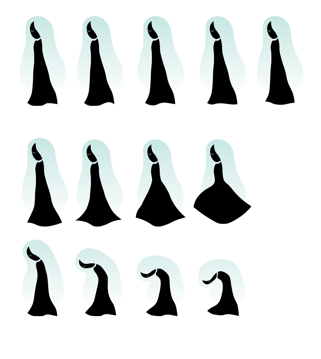 While both characters are one, the brown-haired is the girl after realizing the truth and the black figured one is before. I wanted to convey the contrast of these 2 characters. Inverting the color of one character will give the result of another. The black figure is also meant to convey ambiguity while the white conveys truth.
 | Status | Prototype |
| Platforms | HTML5, Windows |
| Author | meemeemy's game design portfolio |
| Genre | Platformer |
| Made with | Unity |
| Tags | 2D, Atmospheric, Narrative |
Download
Click download now to get access to the following files:
Development log
- Development & PostmortemOct 16, 2021



Comments
Log in with itch.io to leave a comment.
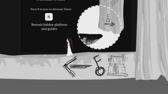
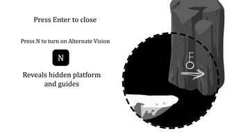
The art is really beautiful! It's all incredibly together and cohesive and makes the game feel very airy and fun to play. I love the platforming challenges as well, I feel that the platforming fits in the world very well and the player is able to traverse the level very smoothly. I want to see more implementation of the alternative vision mechanic!
I love the art style of this game. The color palette is lovely and soothing to view. The concept and the color palette mesh very well and make for a very engaging game. I loved the amount of work that went into this!
Visual art is the one that killed the game. The whole game looks so good, it makes me feel so comfortable. For the game, I remember I playtested your game, it was too hard and barely finished, but this final result turned out so good and the level design is balanced. Nice Job!
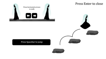
I love this art style, your effort and your thoughtful complex design overall into this project. I remembered how we were working on the homework together and we discussed about this. Me over-stressing that it will be too much but you did it!!! I think overall the story concept works very cohesively with the levels you designed. The tutorial levels are also very helpful that kinda forces the player to play certain mechanics you would like them to play(especially the bowing aspect) when players crosses a mountain. I also love the black/white light off design aspect where the player can play in a different field. It changes the feel and the playfulness throughout the game. I will love to see any further development on this game just like you plan like different special abilities where a player can do and etc.
The art style to this game was actually insane. I cant believe you hand drew everything. You did an extremely good job at worldbuilding as well (especially with the alternate version space). I did die a lot, and I wished there was some way to prevent this. That however is a very minor piece of feedback.
I gotta say the art style is amazing, from the Demo I saw in class there's definitely things to be improved code wise (and maybe more animations), but the art style just makes this game look so polished that I can just overlook some of the flaws.
Really like the art style, character design, and color choices of this game. Each level even has different color style, makes them look amazing. For suggestions: you can add more save point in every level or add a health system to make player not die by one hit.
The game really calmed me down, it healed me. Everything is just right, from the music to the graphics, including your unique character designs. I just wanted to tell you how much I love your visual design style. Keep it up! I want to see more of your work!